Work / Art Direction, Editorial Design
D1GIT
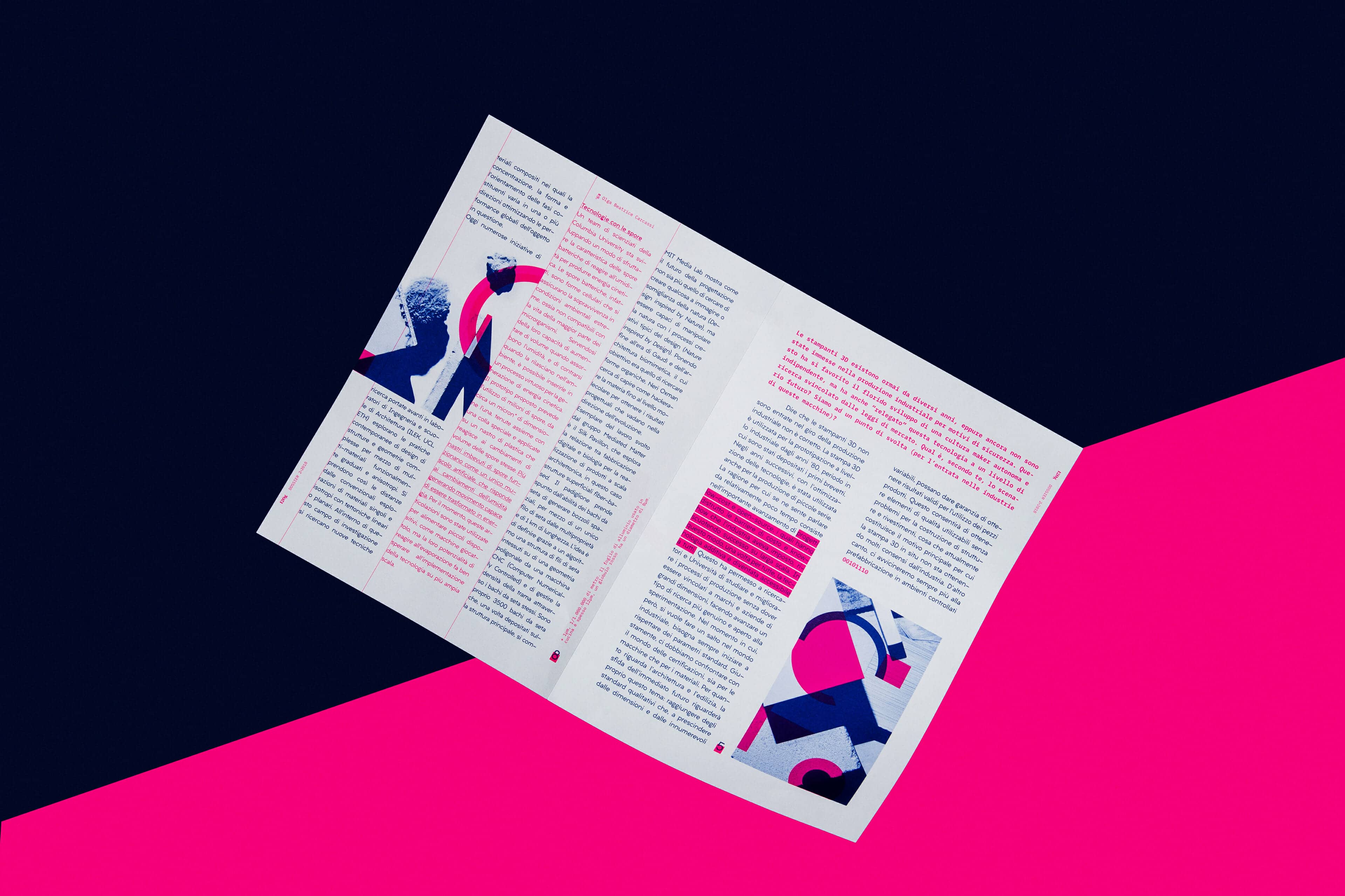
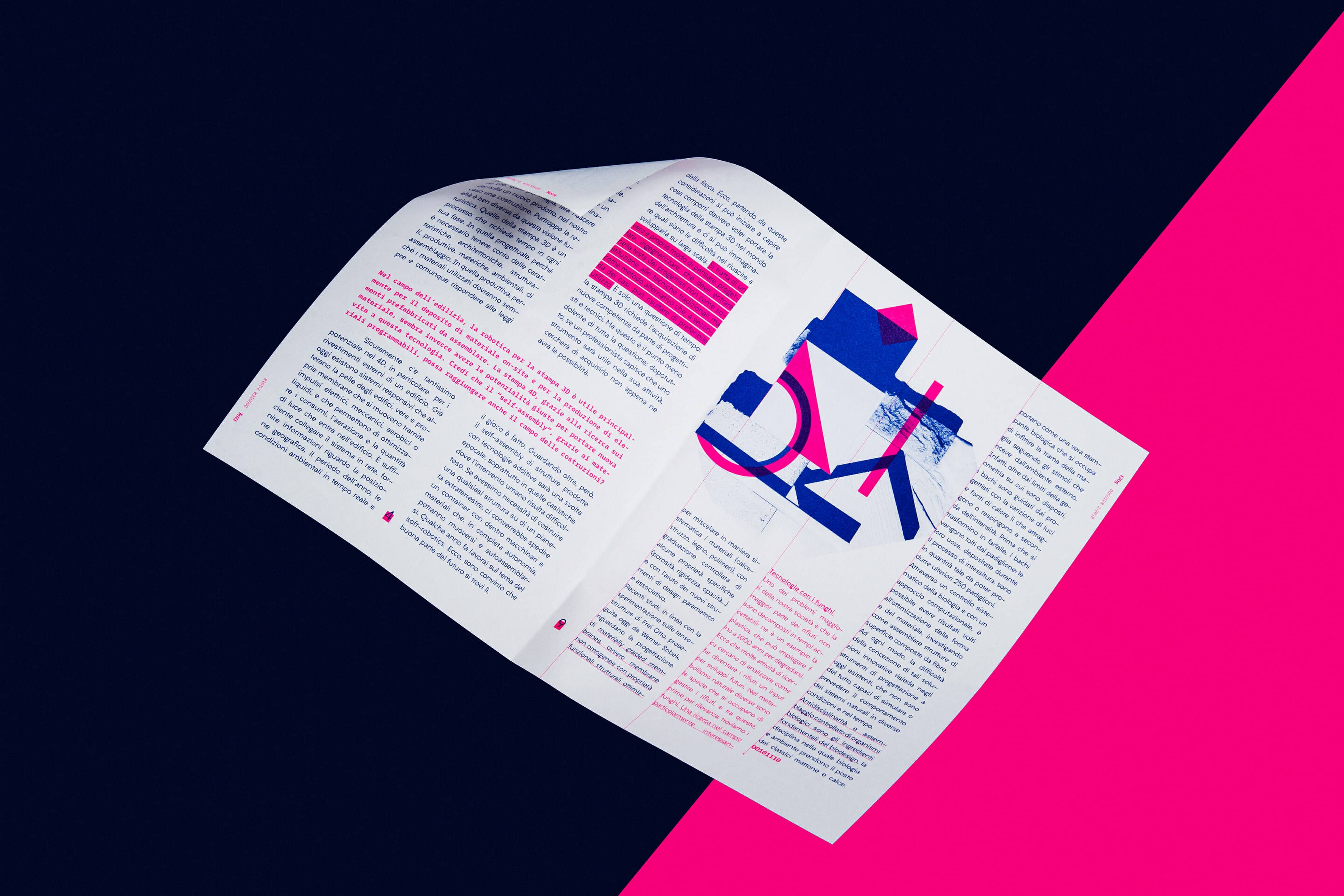
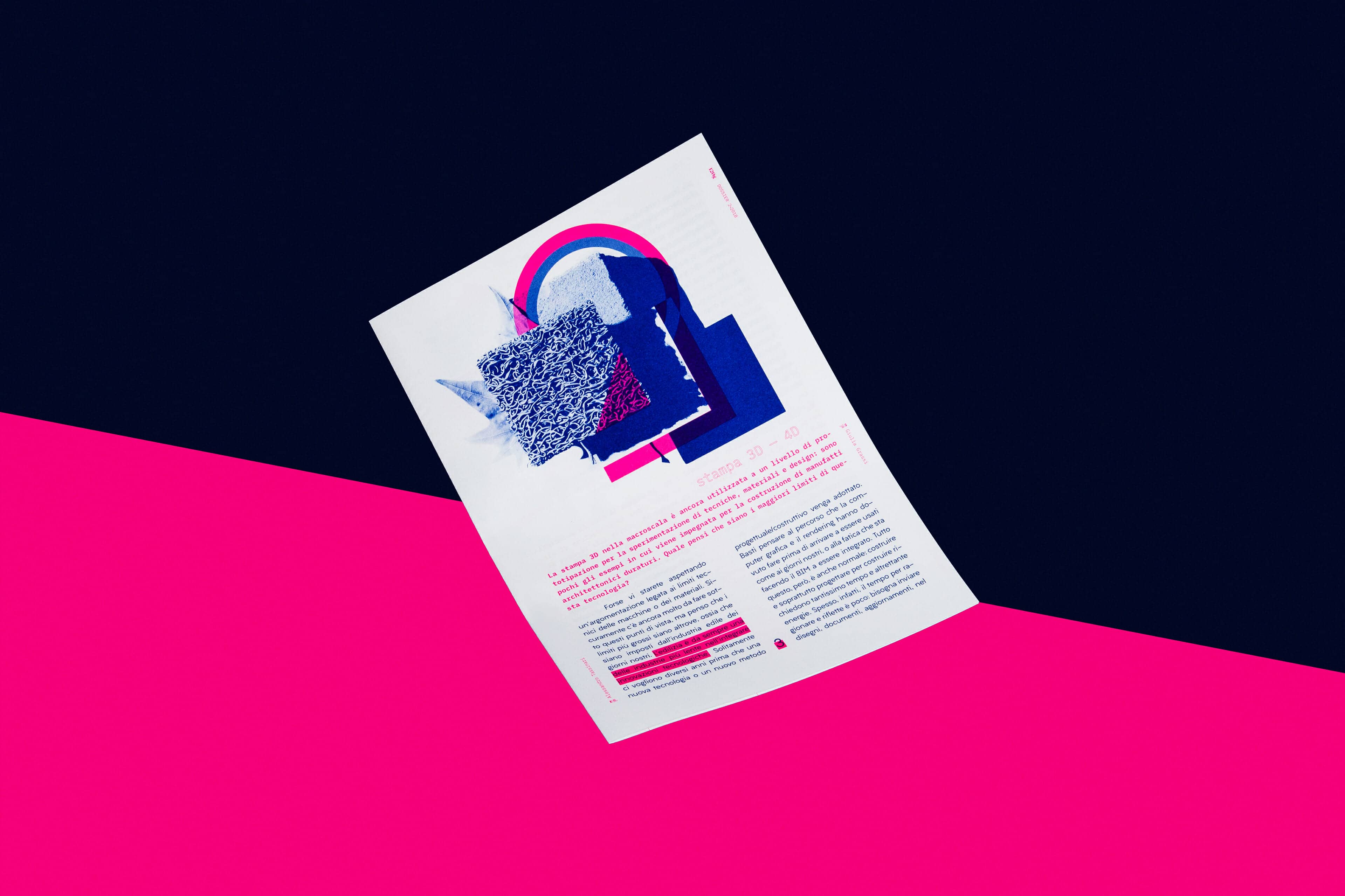
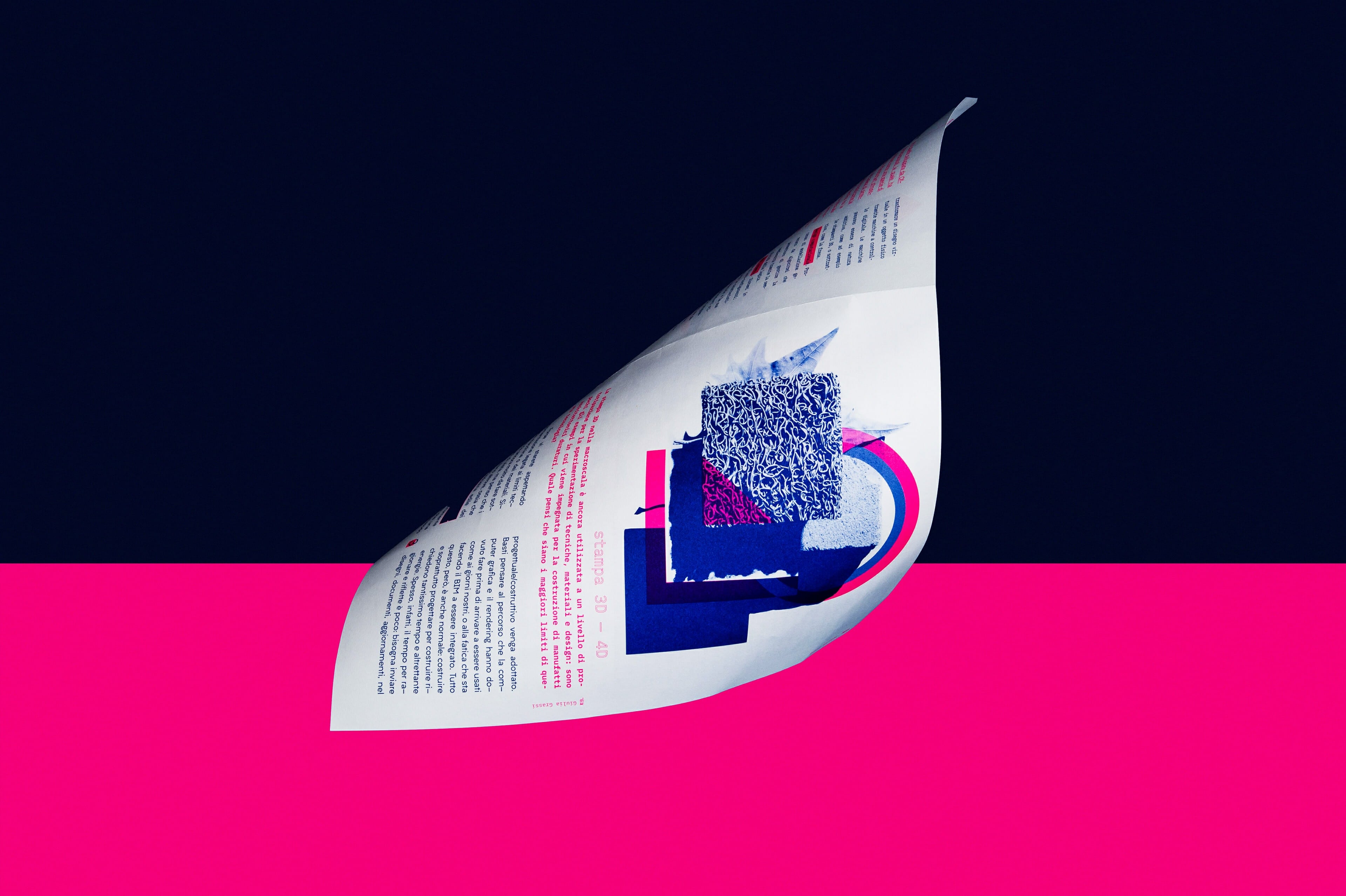
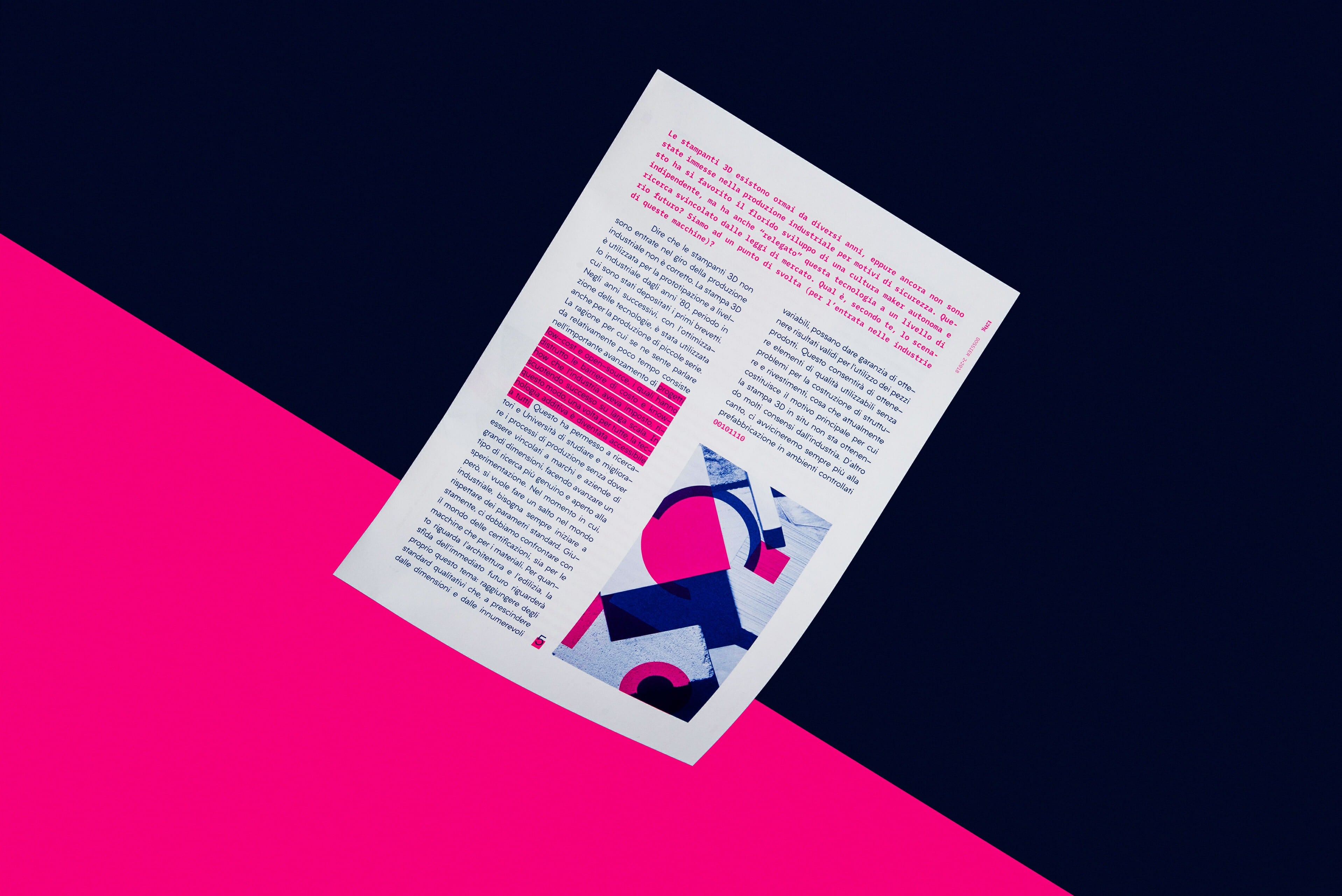
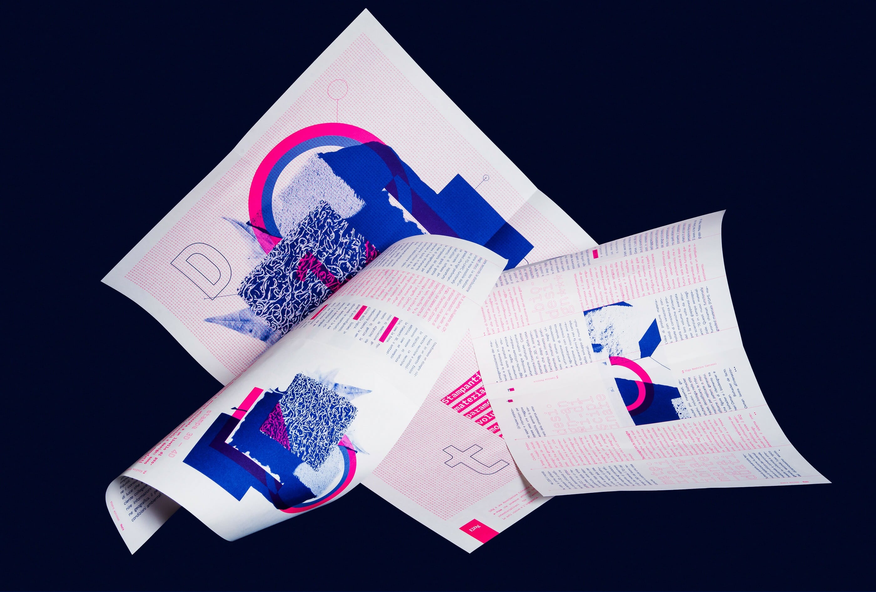
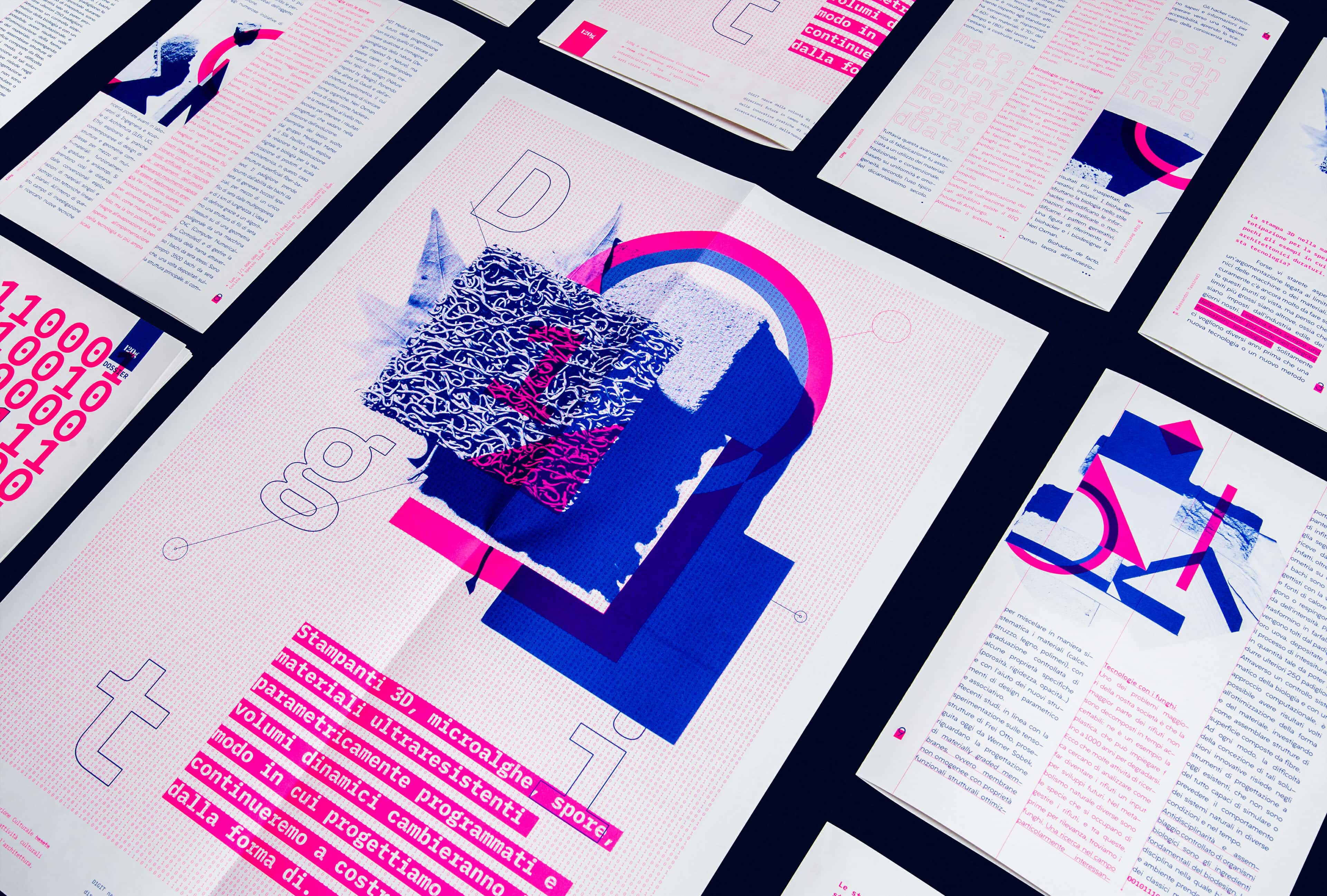
D1GIT is a printed visual magazine by cultural association 120g exploring technology applied to architecture through bold editorial design and experimental imagery. It mixes photography, 2D graphics, and vibrant typography to stage the tension between nature and innovation in built environments.
120g
centoventigrammi.it
TDC65 Certificate of Typographic Excellence 2019
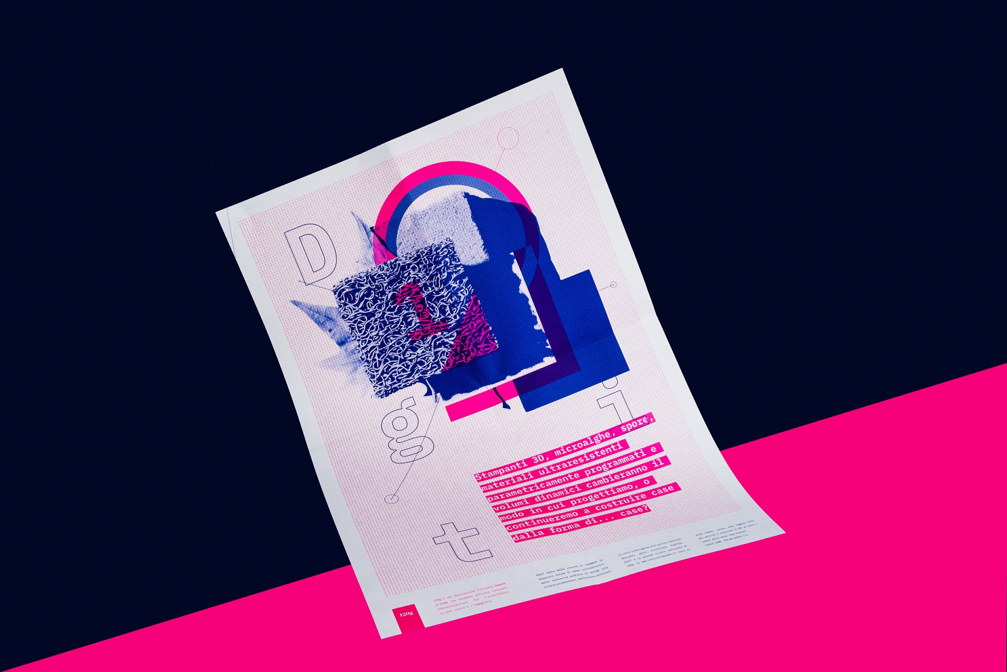
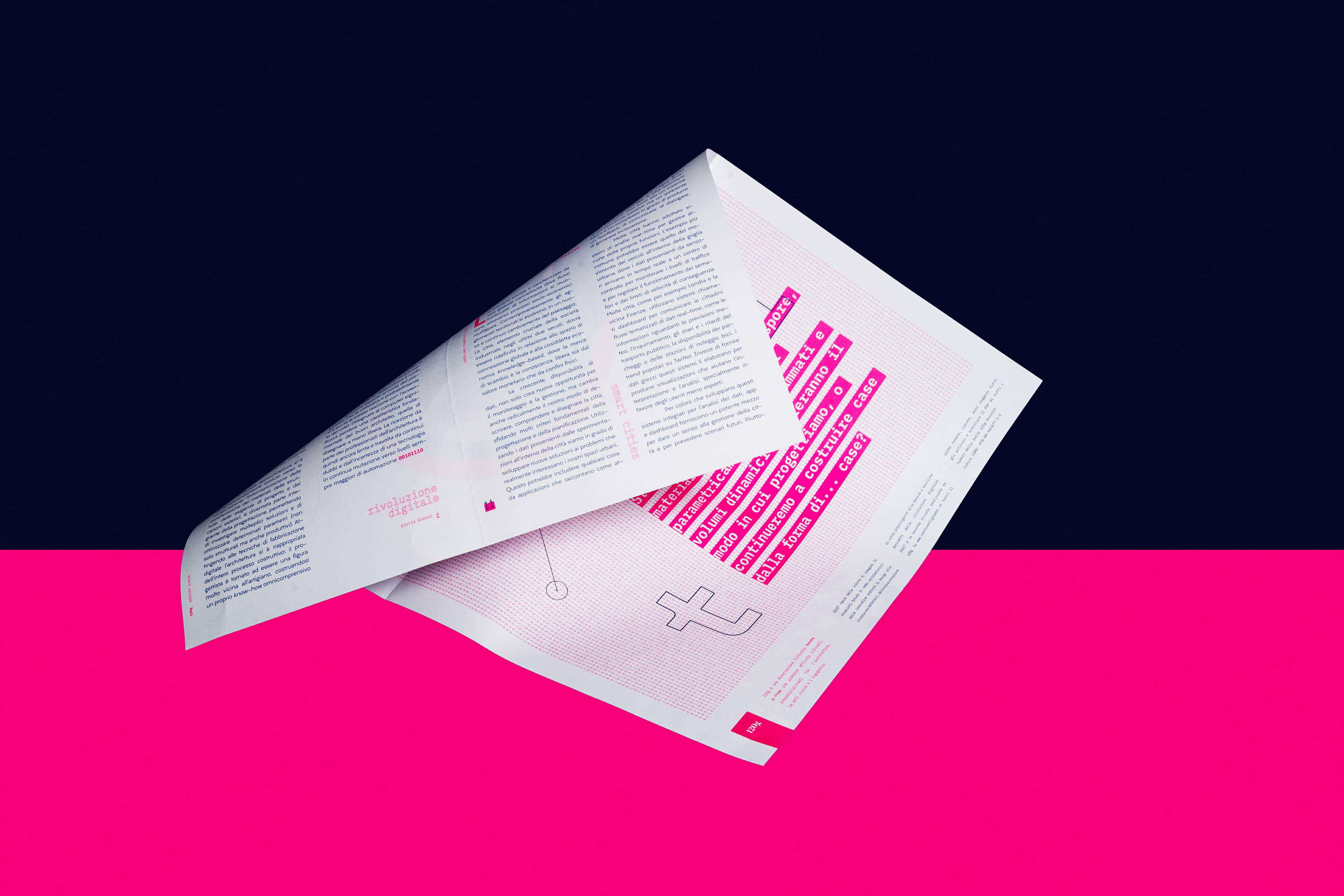
3D printers, micro-algae, spores, parametrically programmed ultra-resistant materials and dynamic volumes will change the way we design, or will we continue to build houses in the form of… houses?
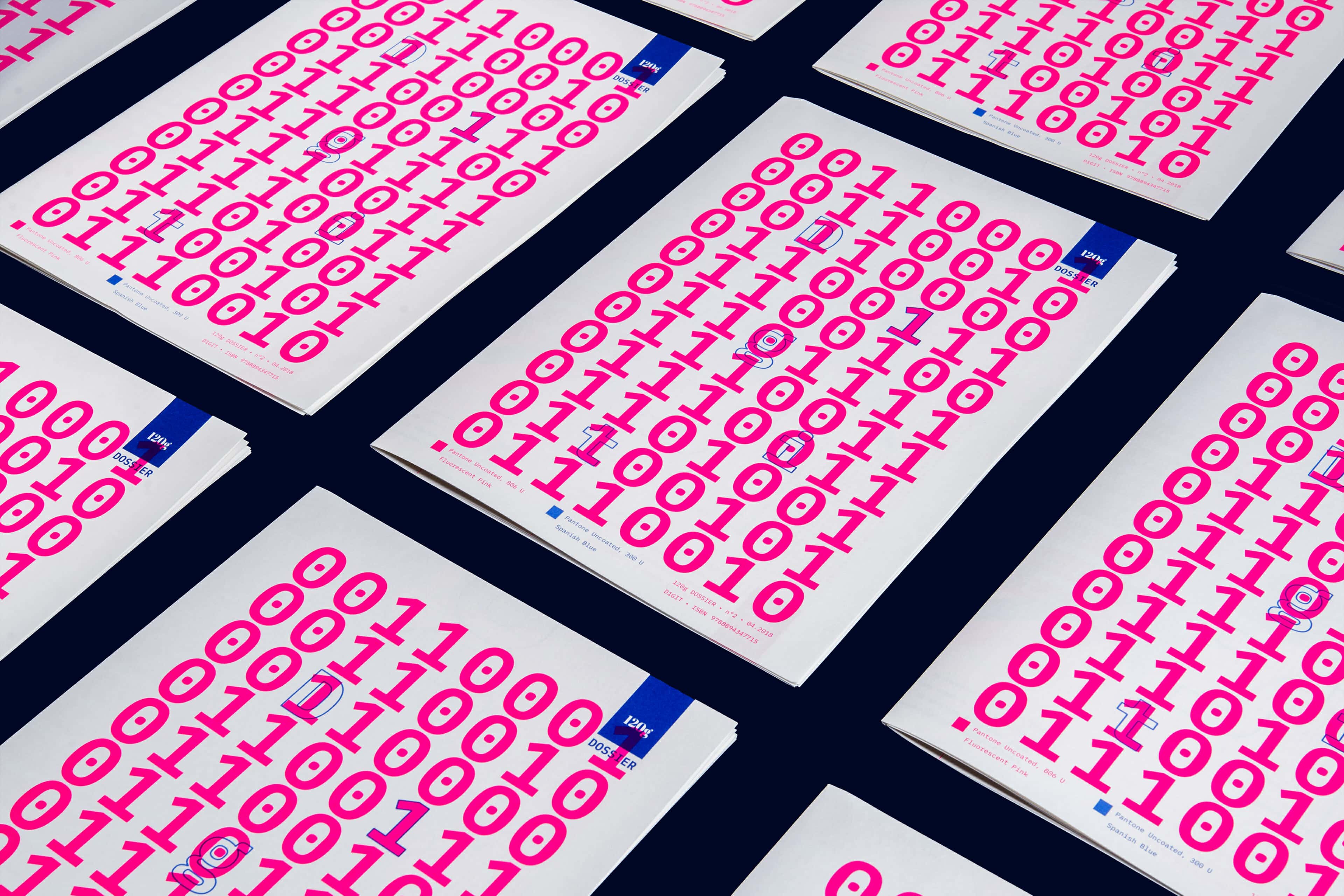
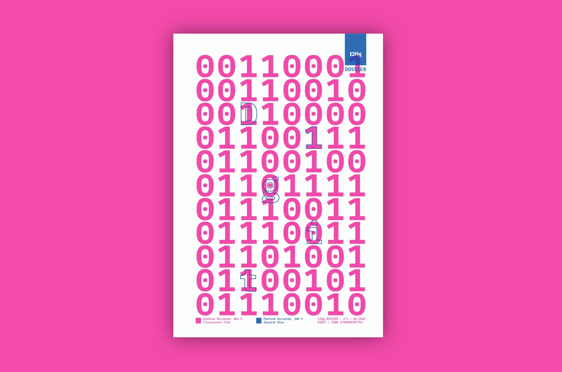
Second issue (first here ) of 120g’s zine, printed on Fedrigoni Old Mill 130gsm paper in offset, 2+2 colors: Pantone 806 U Fluo Pink and Pantone 300 U Spanish Blue.
Inheriting the format from the first issue — a 340x240 mm for 12 pages and a folded poster which works also as cover — D1GIT exploits dramatically the power of type, bold colors and semi-abstract imagery, resulting pop and futuristic, never compromising the readability.
Two typefaces: Liber Grotesque by our friend Valerio at Hederae Type Foundry and IBM Plex Mono.
All the images are a duo project by Ray Oranges and Francesca Dattilo ; Francesca shot also all the wonderful studio pictures of this webpage.
Enjoy the making-of in the video below, and have a look at the magazine on 120g website.
D1GIT has received the Type Directors Club “Certificate of Typographic Excellence”. It will be included in the 2019 Annual of the Type Directors Club, The World’s Best Typography, and will also be shown at the 65th Awards Exhibition (TDC65) in New York City and in 8 other cities around the world.